We’re excited to unveil our fresh new branding for the National Open Youth Orchestra.
Our logo combines an accessible, easy-to-read font with an icon that changes, using variations created with musicians’ input. This mirrors how they shape NOYO with their personalities and individual talents.
It started with a big question: what should our brand feel and look like? Musicians were loud and clear about wanting a “bold” and “colourful” logo, voting to combine typography with an abstract icon.
The design process imagined by our friends at Fiasco put the young people at the heart of the design process, inviting them to participate in composing the NOYO logo.
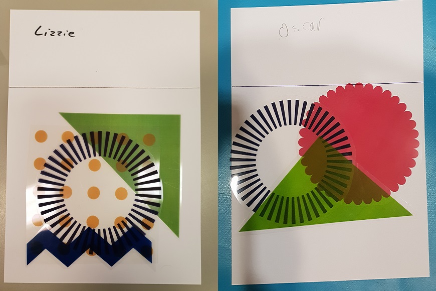
After some research into accessible colours, Fiasco devised ten fun shapes to play with, using an autism-friendly colour palette.
So many possible arrangements…
Below are some icons that were created. You can see the logos they’ve become throughout our website. We’ll use all the different versions for our print, online and social media communications.
Hot-off-the-press! Watch Ella direct the creation of her icon during the NOYO residential which took place in April. Assisting her is guest Jennifer Raven from Sound Connections:
Ella’s logo: